Carta Iconography
Improving icons in Ink, Carta's design system
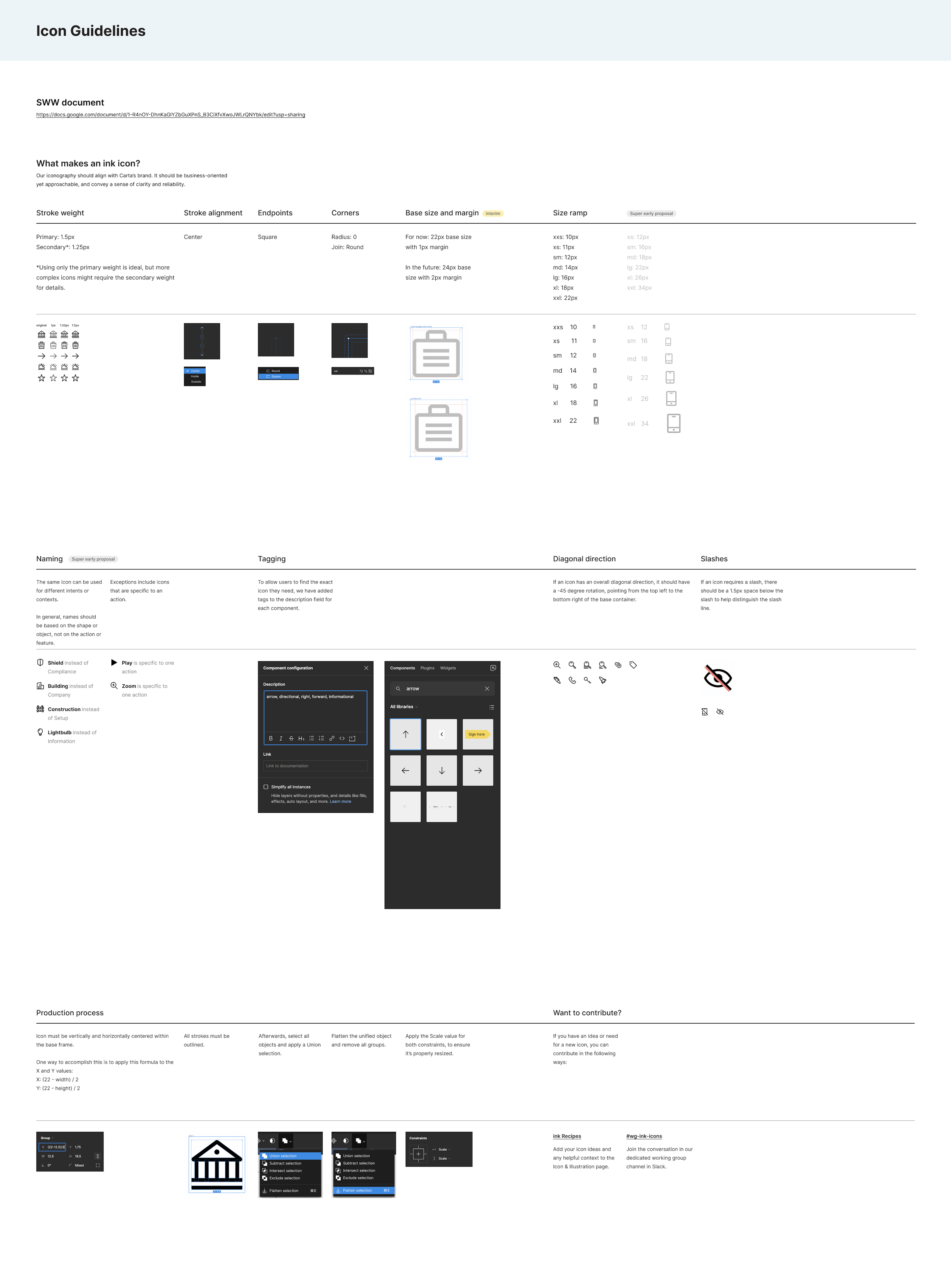
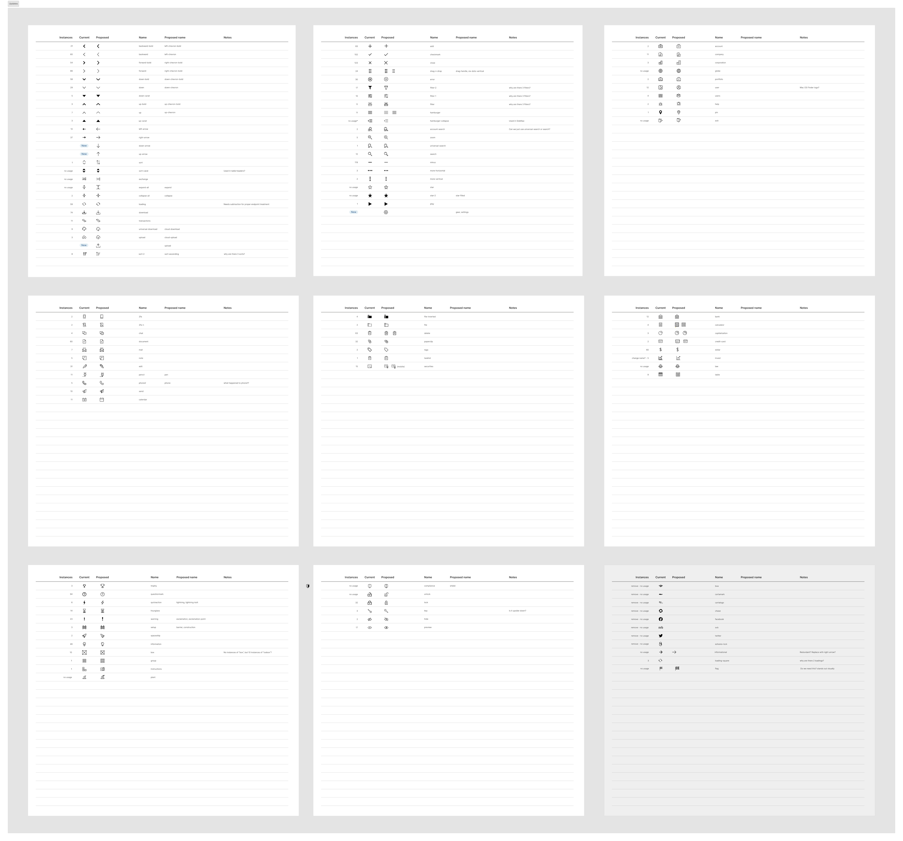
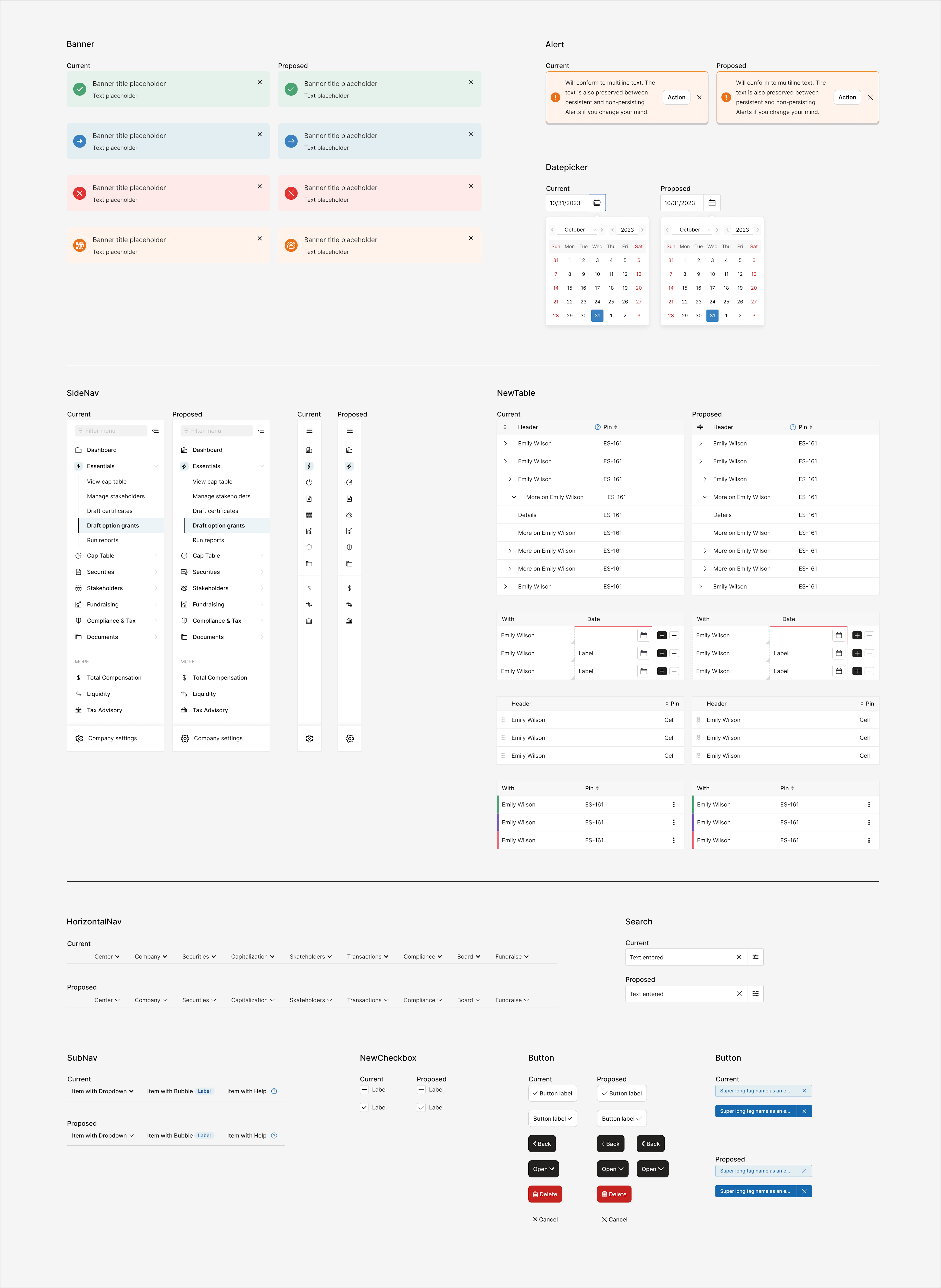
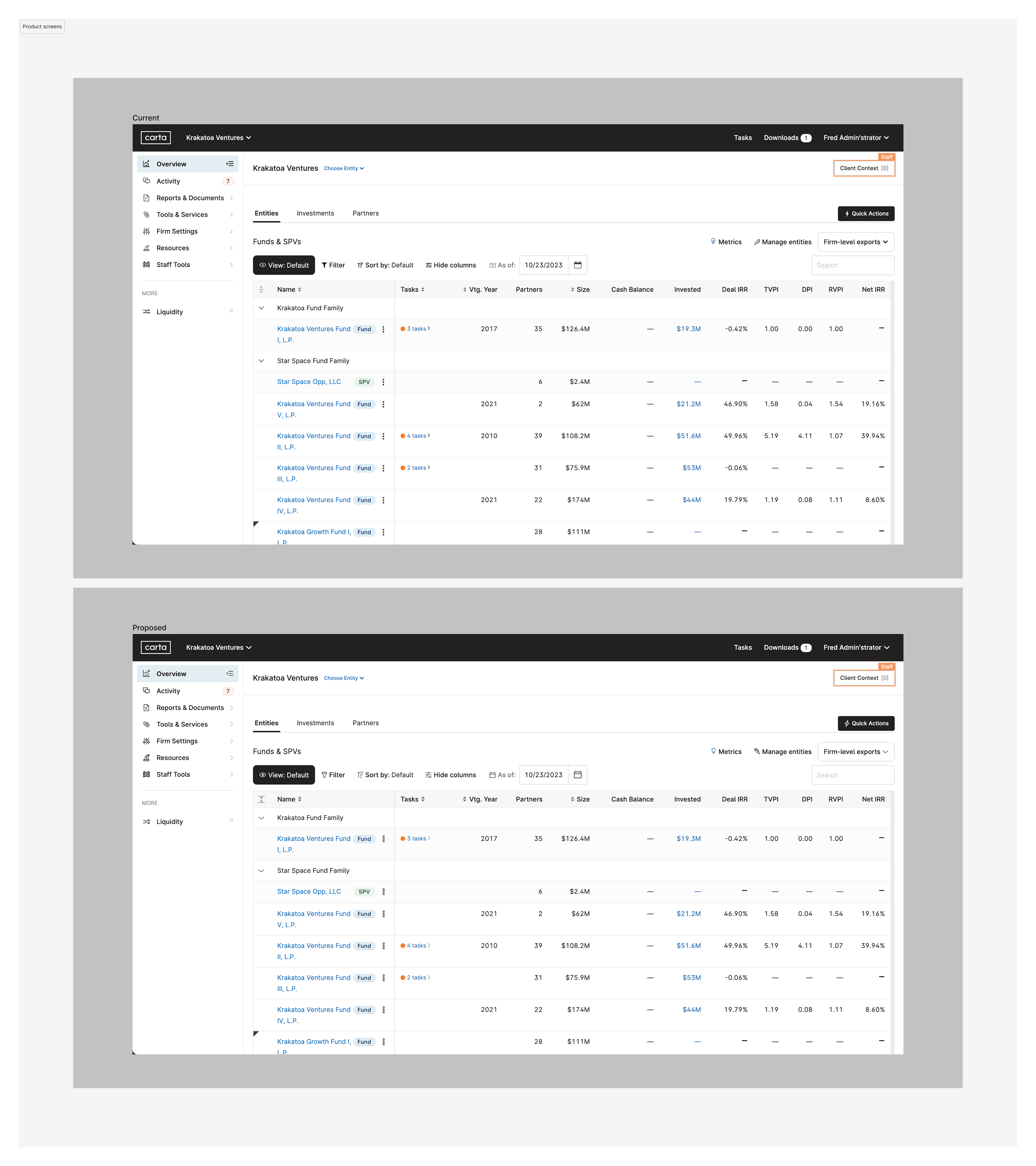
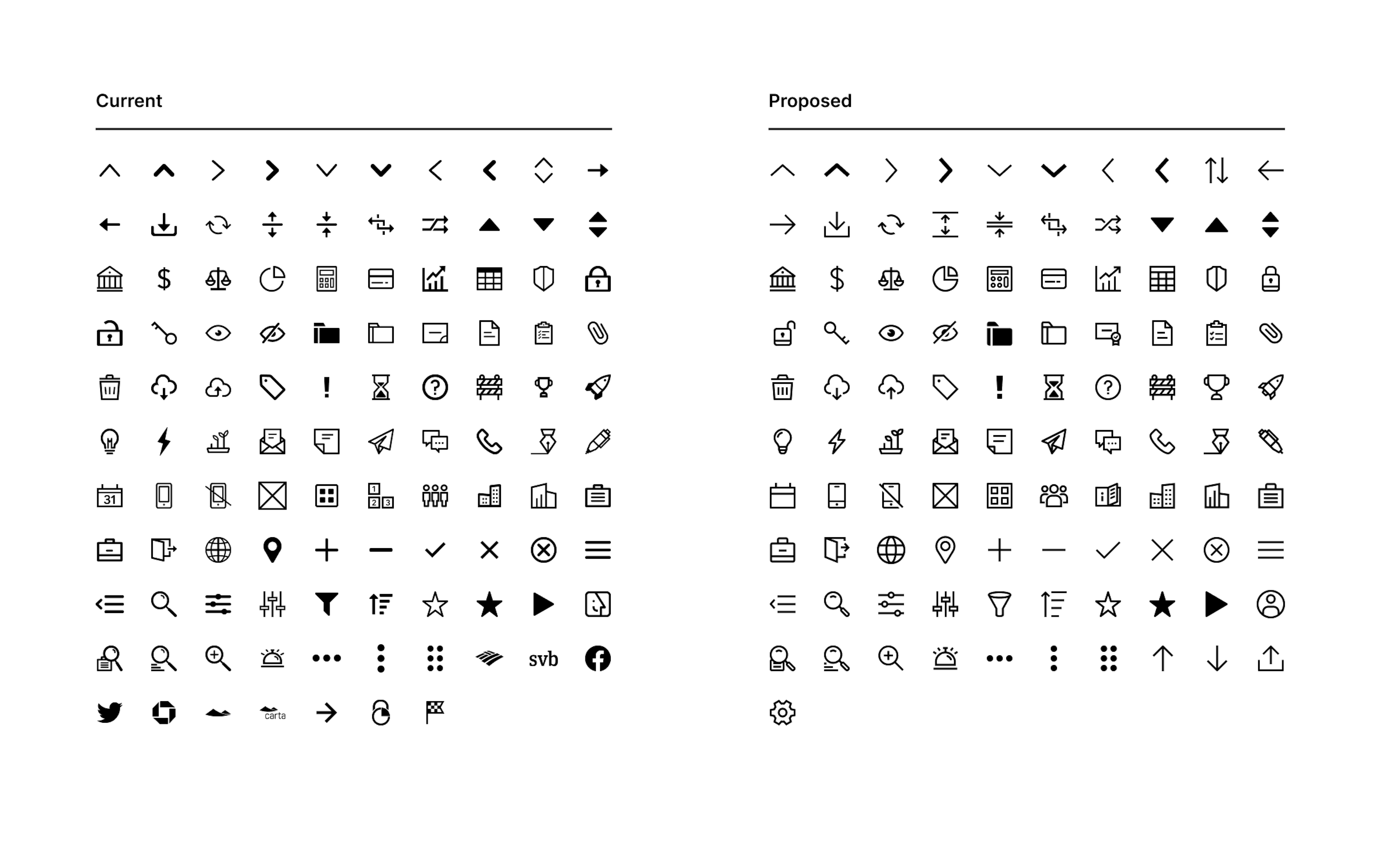
After only three months at Carta, I took on the task of improving the iconography in Ink, our design system. I lead the project and worked closely with Ink visual designers, as well as designers from the brand and marketing teams. It started with a thorough audit of the current icons, which at the time, were inconsistent in stroke, metaphor, and naming, and included outdated logos and duplicates. I worked with visual designers to rework every icon, iterating and refining until we had a cohesive iconography, and more importantly, proper documentation and guidelines. These guidelines are also part of our contribution model, allowing any Carta designer to contribute to Ink. After approval from the product design teams and leadership, I implemented the changes to all of the icon components in Ink, tested and tested again, and finally shipped the changes to production, all before my first six months at Carta.